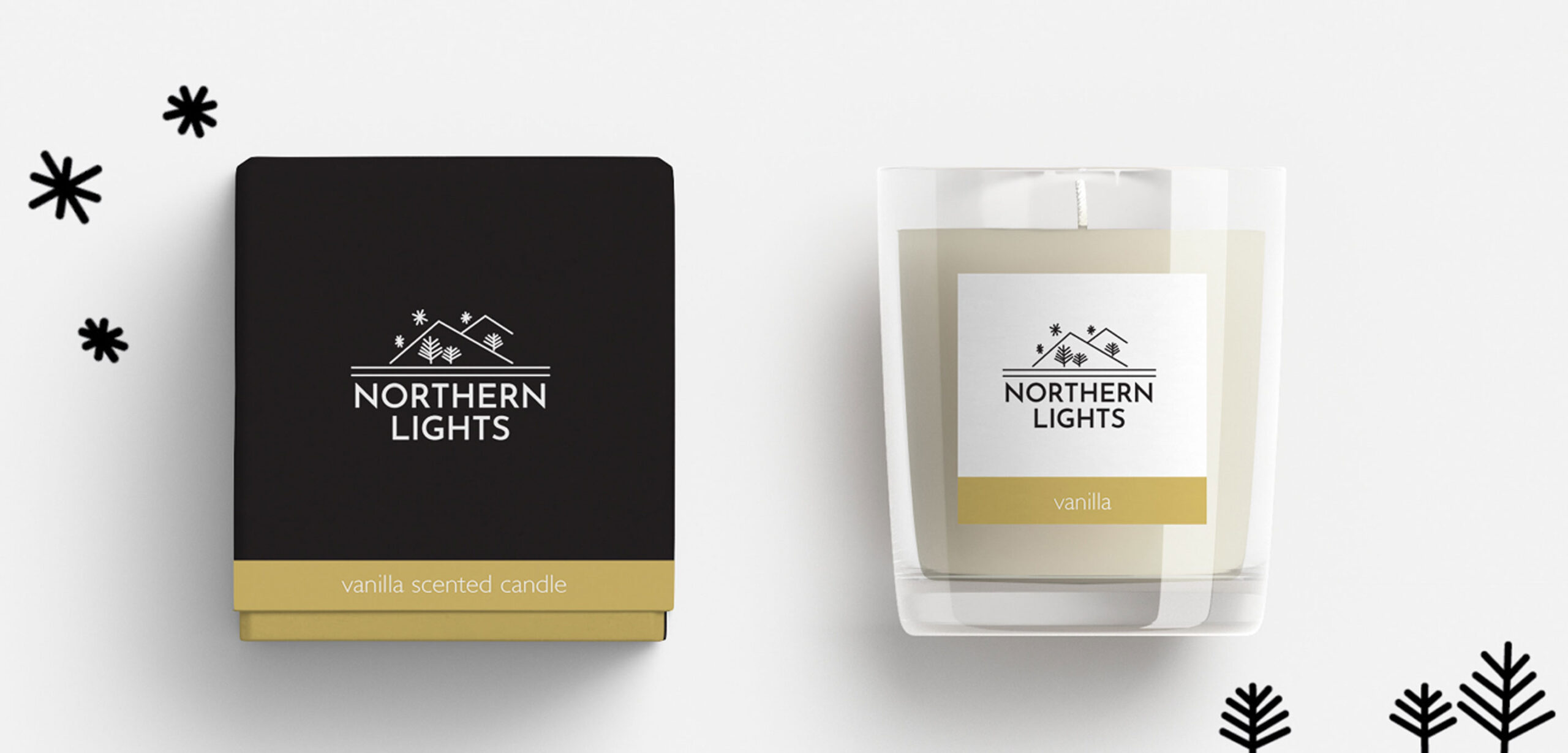
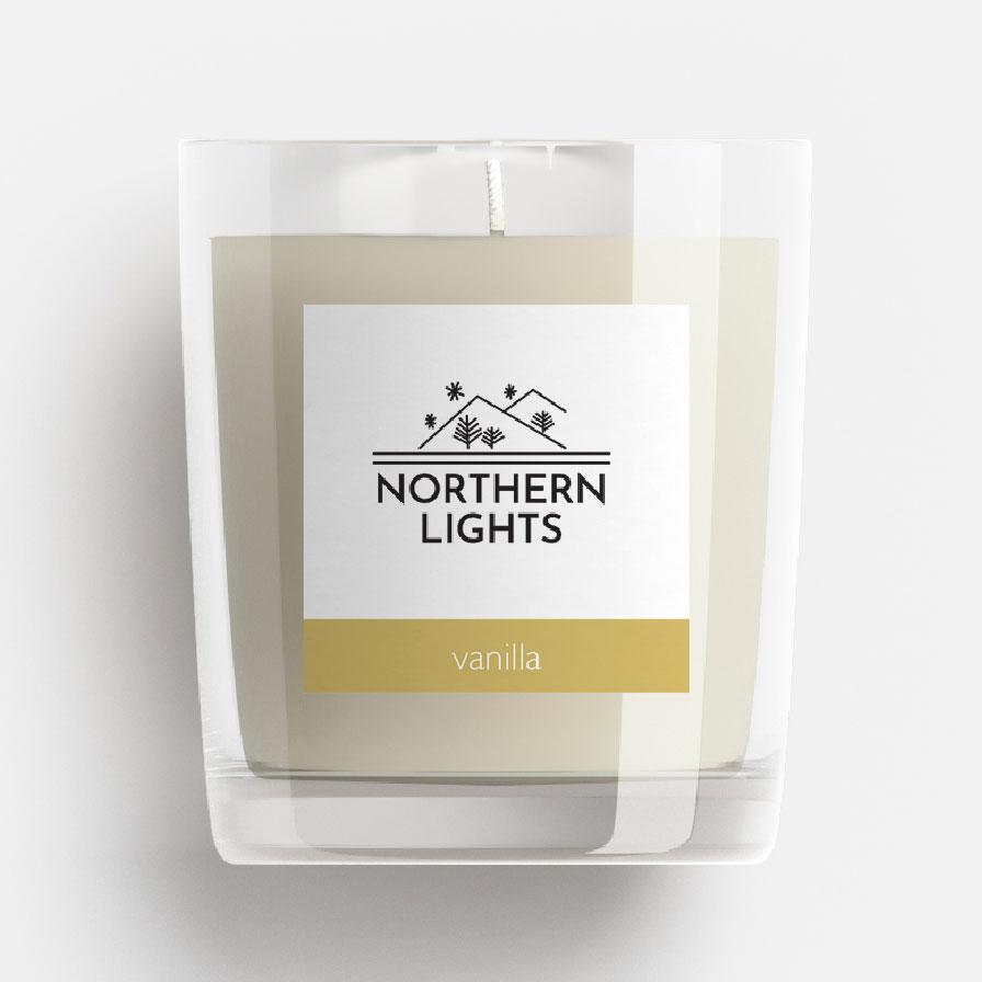
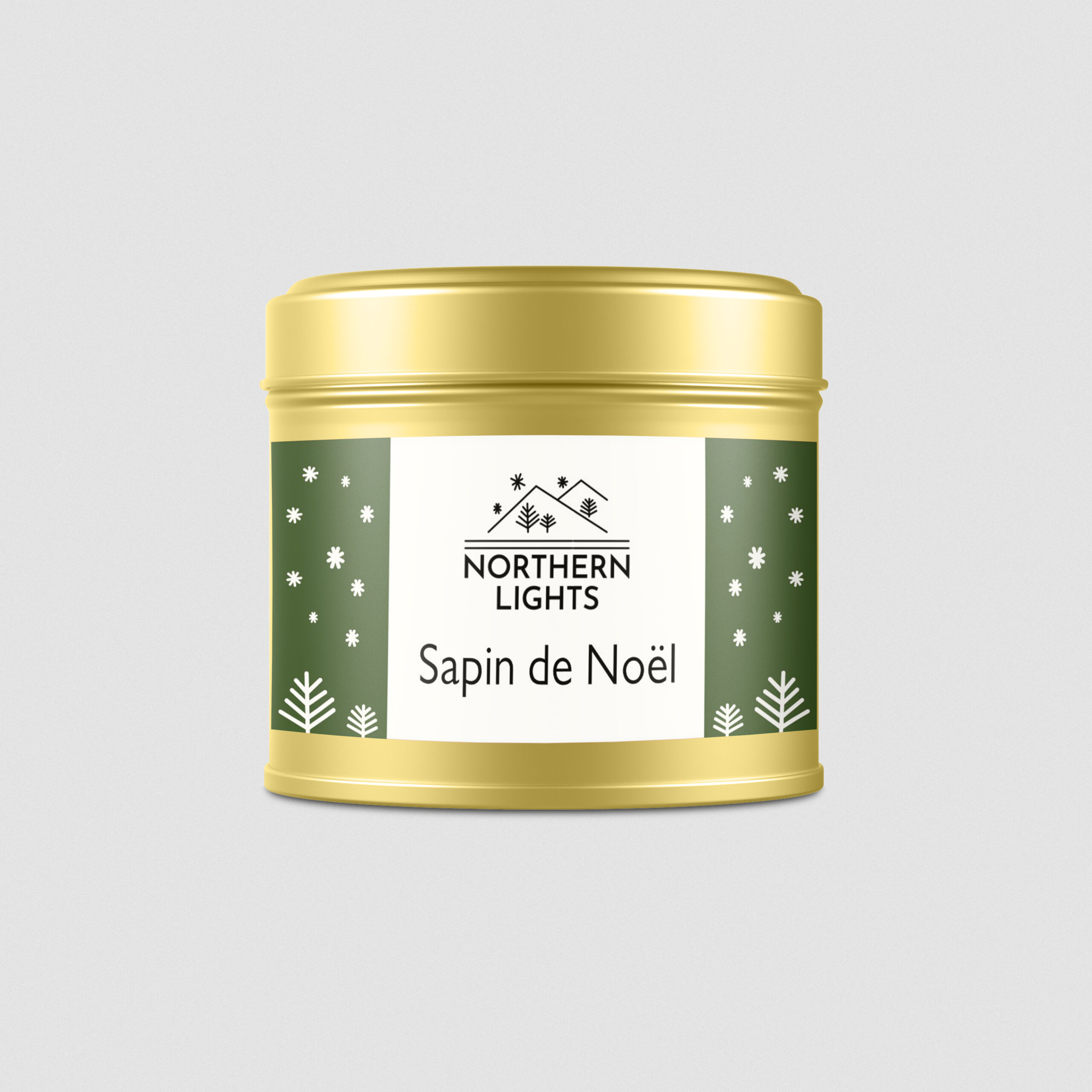
Northern Lights are a Paris based candle company with Norwegian/Sami roots. An identity inspired by the simple, line work of ancient Sami art was developed, and packaging designed for these beautiful natural candles. Labels were designed in a templated approach, allowing the owner to create their own new labels with ease for each new fragrance developed in the range.
IDENTITY CONCEPT NO. 2.
Several initial ideas were presented to the client, with the Sami route (above) being developed further. Here is one the routes that was presented but not pursued.
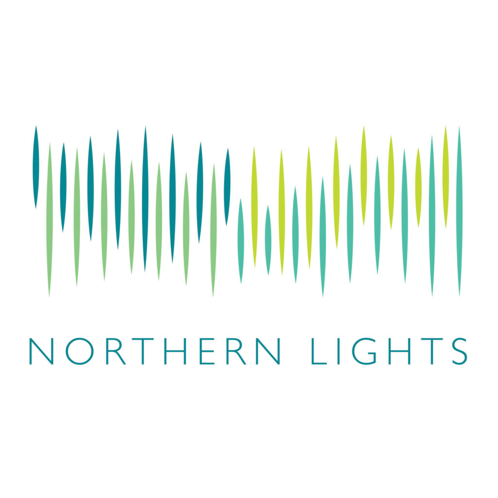
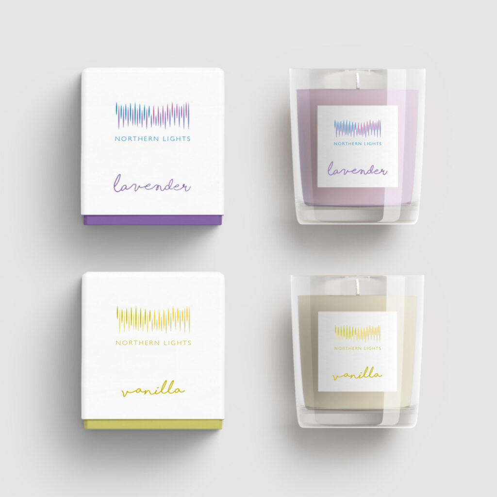
An identity inspired by the aurora borealis, the ethereal northern lights visible in the night’s sky of northern Scandinavia. Capturing in an abstract, graphic form the effect that the different colour streams of light in the sky created. How an overall tone or colour would in fact be the product of many different colours combined and its shape definitive yet also meandering – complicated concepts to convey in a logo.
I proposed this chameleon of a logo, one which did not exist in any one colour or version, but would change across all fragrance variants, made of multiple colours and shapes whilst still being a clean and simple logo design.
BE CURIOUS AND DISCOVER more DESIGNS THAT DIDN'T MAKE THE FINAL CUT.