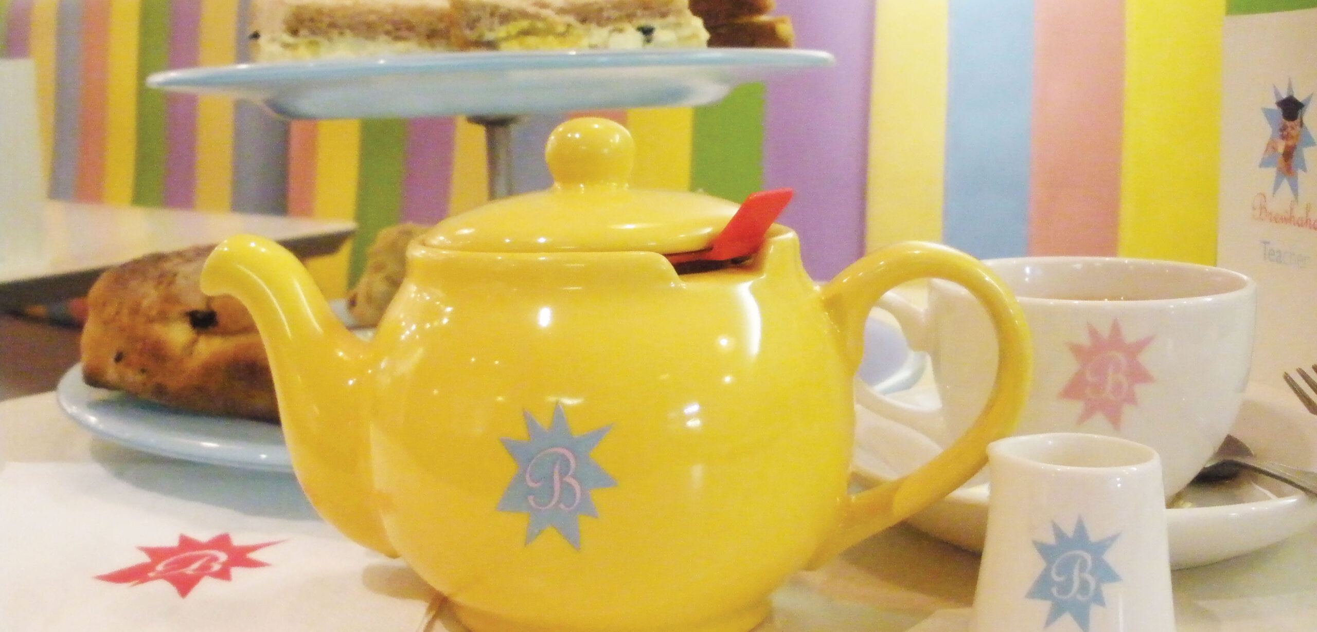
I hesitated about including this project in my online portfolio, it is the first job I ever worked on when I was a recent graduate so of course my skills have evolved a lot since. The photos are grainy, poorly lit and taken by an amateur (i.e. 21 year old me), I’m sorry.
BUT I have so much affection for this project. To set the scene: I’ve recently graduated university and have accepted a job in a tiny agency, it is in a shabby studio in east London with a skeleton staff: me, 1 other graphic designer (a recent graduate himself) and an interior designer. I’ve turned down job offers from larger, slicker agencies to start here because I wanted to throw myself in at the deep end – and boy did I do that!
What I didn’t appreciate at the time, was how strange the setup of the agency was and how much responsibility was mounted onto me as a junior. When the agency secured a new client, myself and the other designer would pitch internally to ‘win’ the new account. Whoever won the pitch would take on the client, being the sole; designer, creative, copywriter, account handler, artworker (the list goes on) for the client, an incredibly unusual circumstance for an agency designer. I won Brewhaha as my first client.
Brewhaha was a tea brand who had built an impressive following of loyal customers and their teas were found in Harrods and other high-end groceries. They had approached us to get their branding in-order and to launch their first tea room in Glasgow. I worked directly with founder Joanne to bring their brand to life.
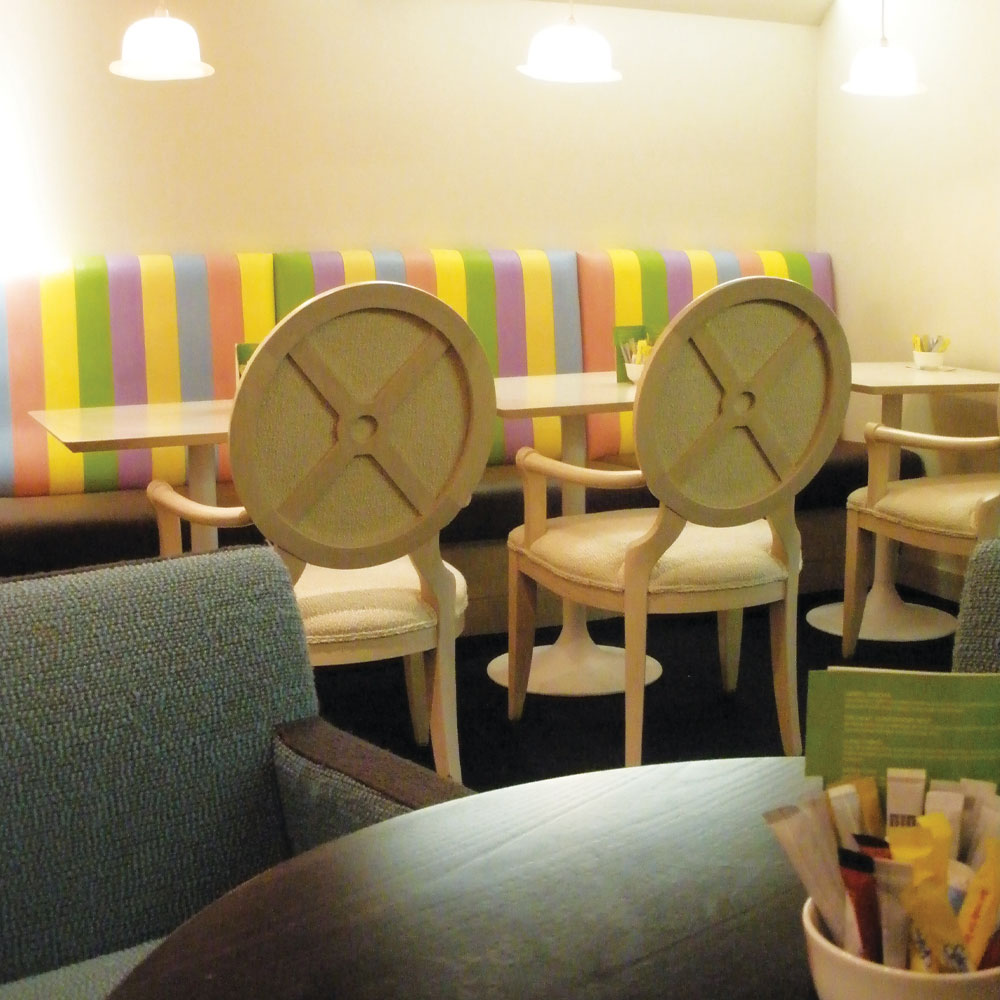
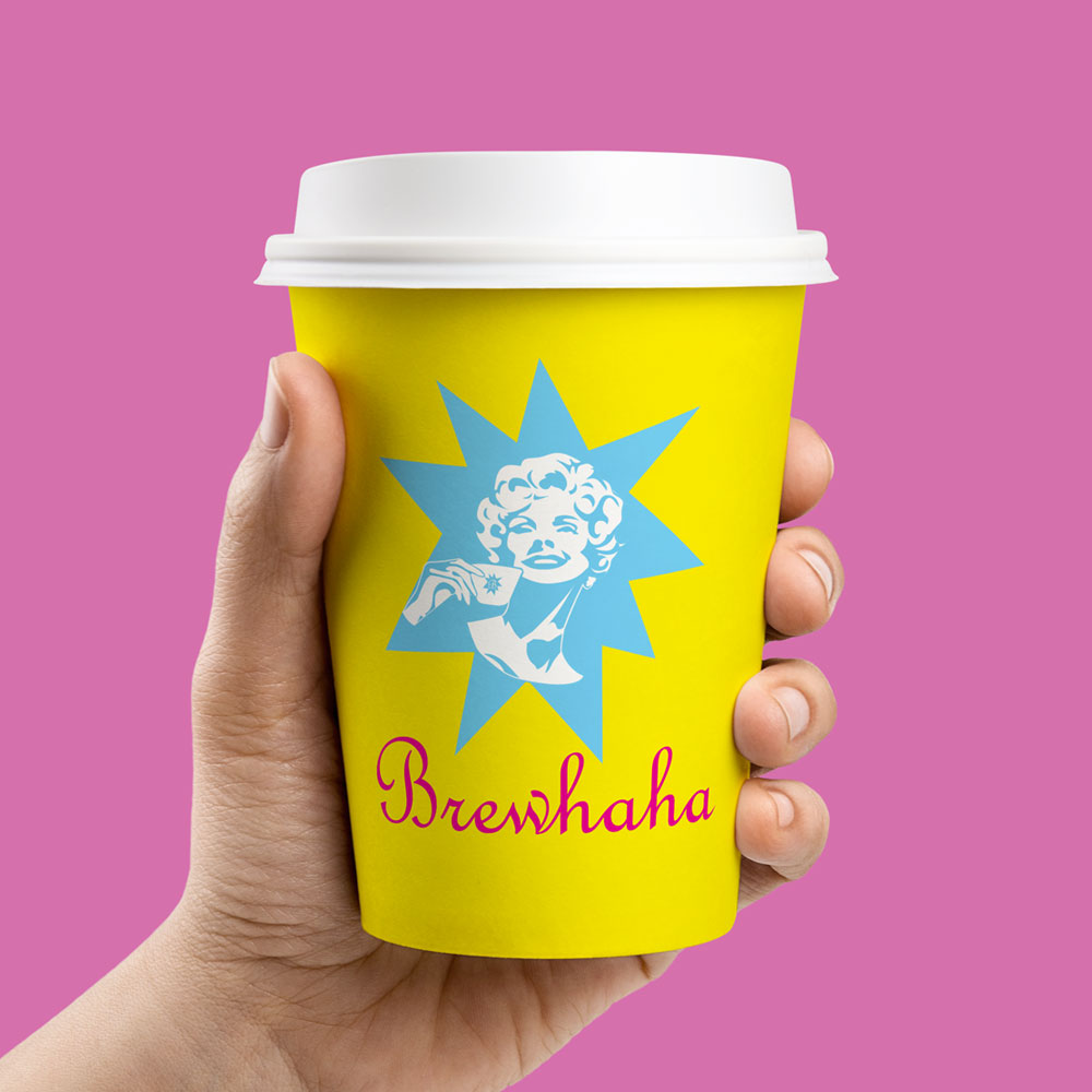
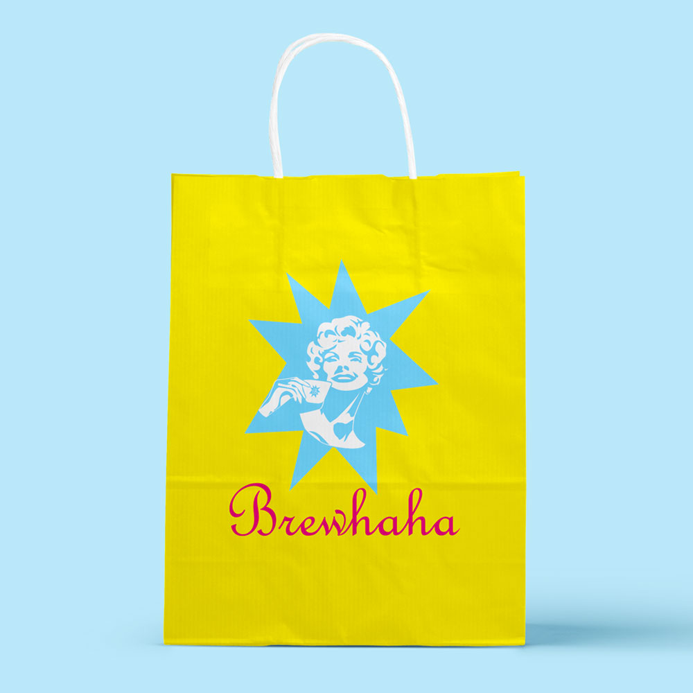
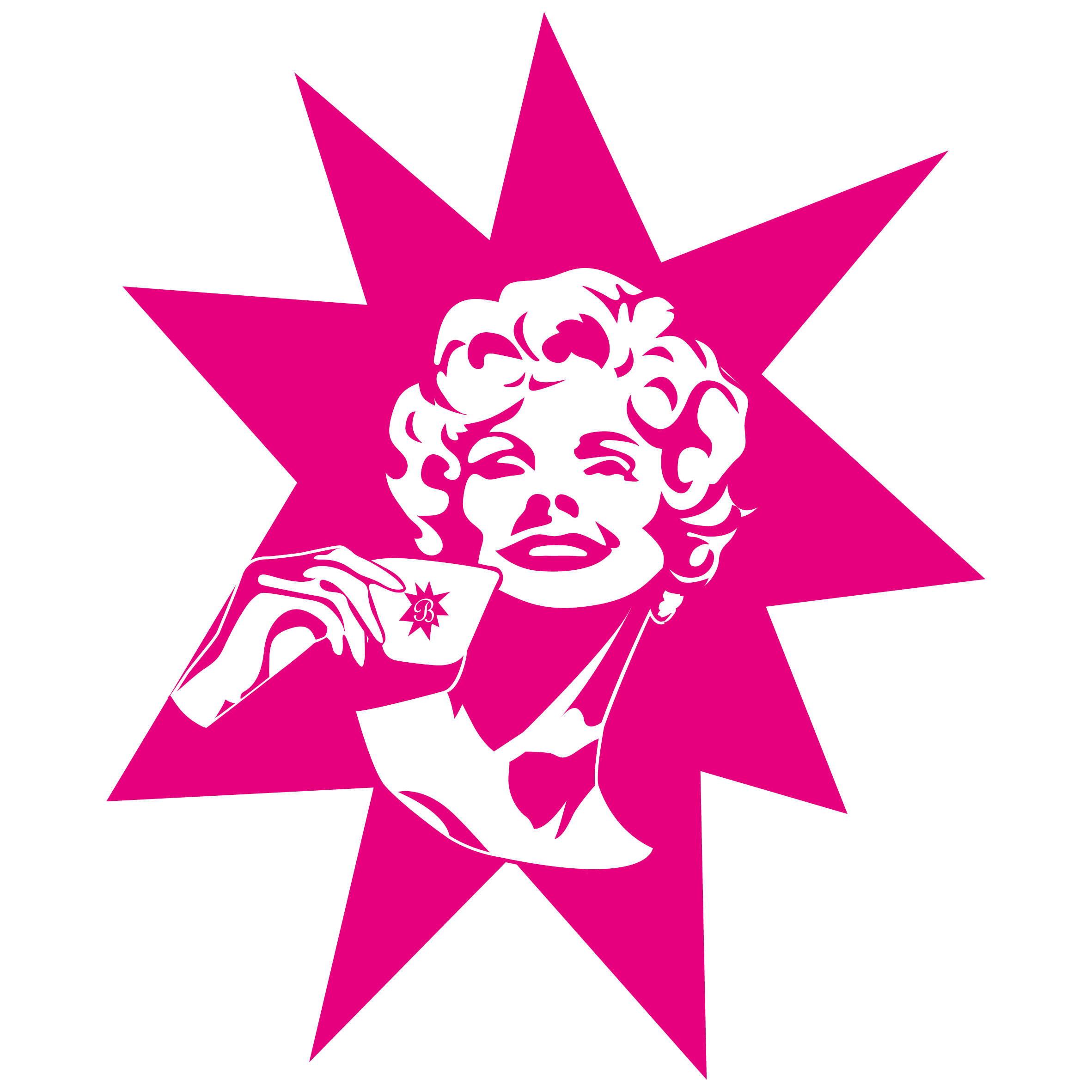
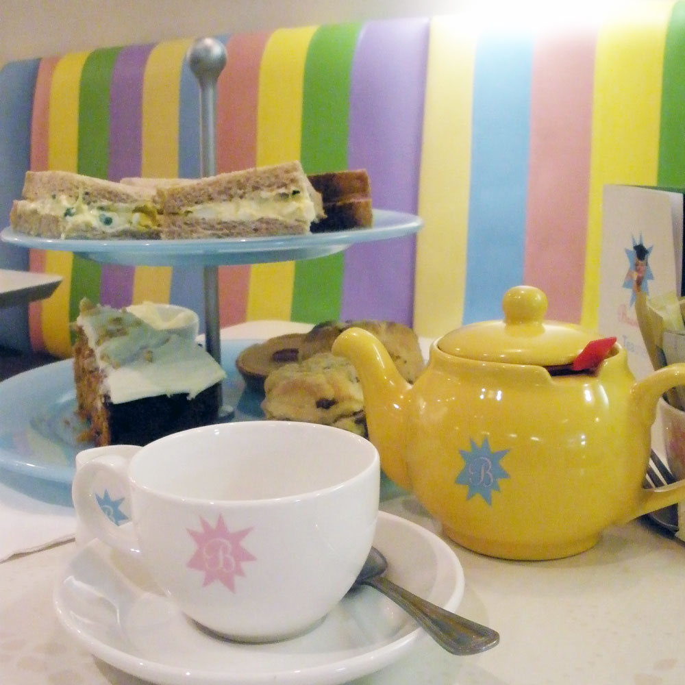
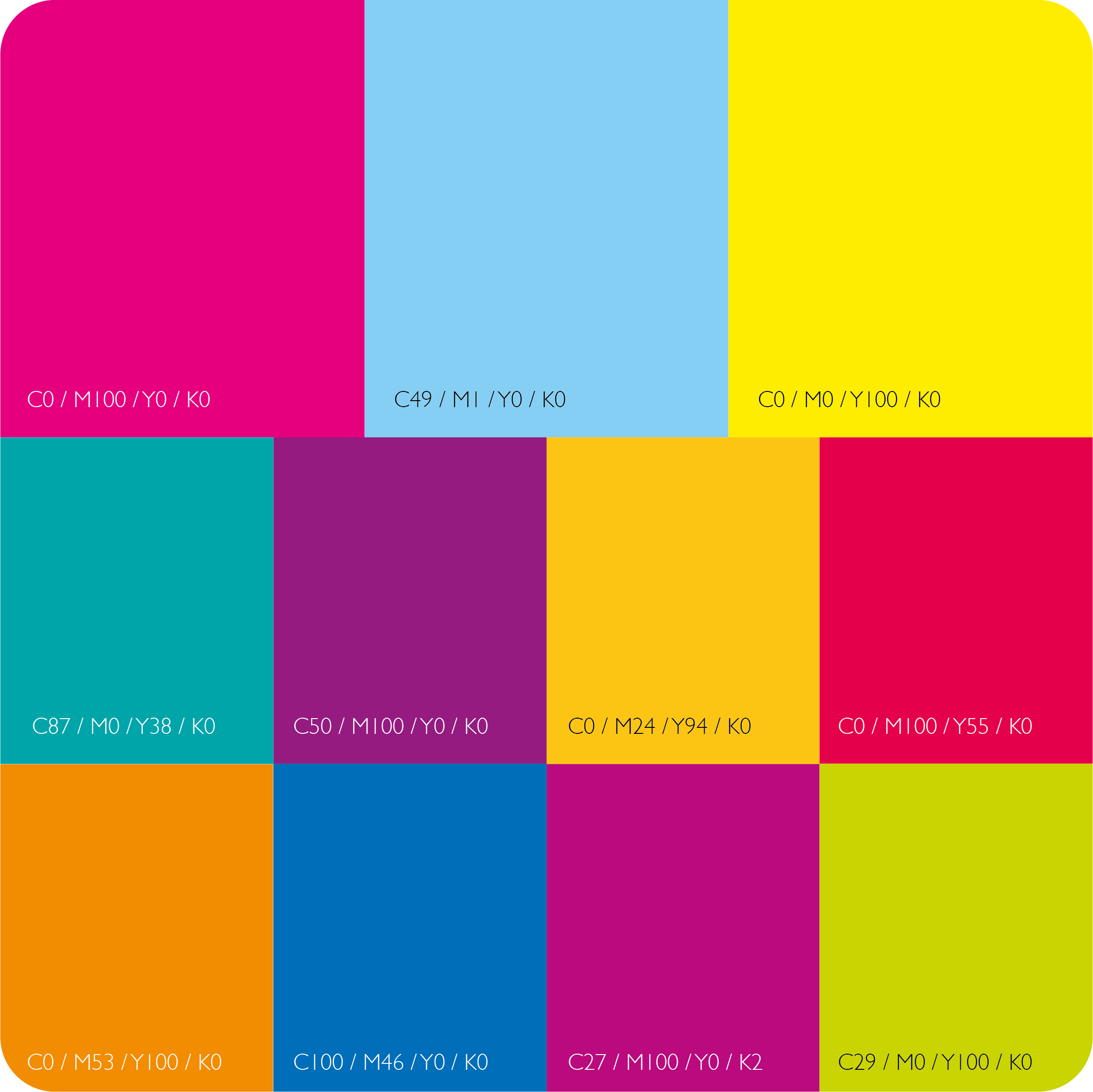
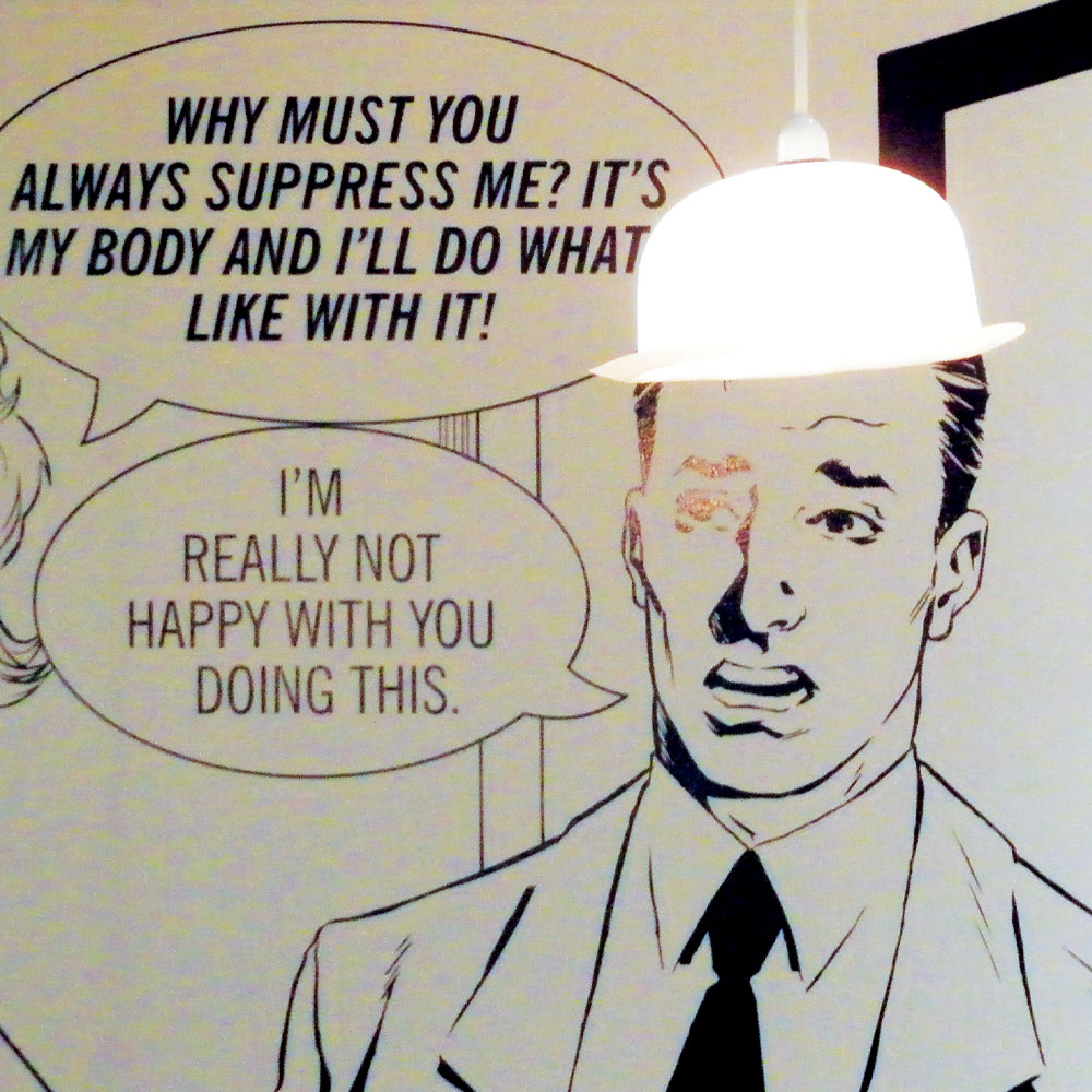
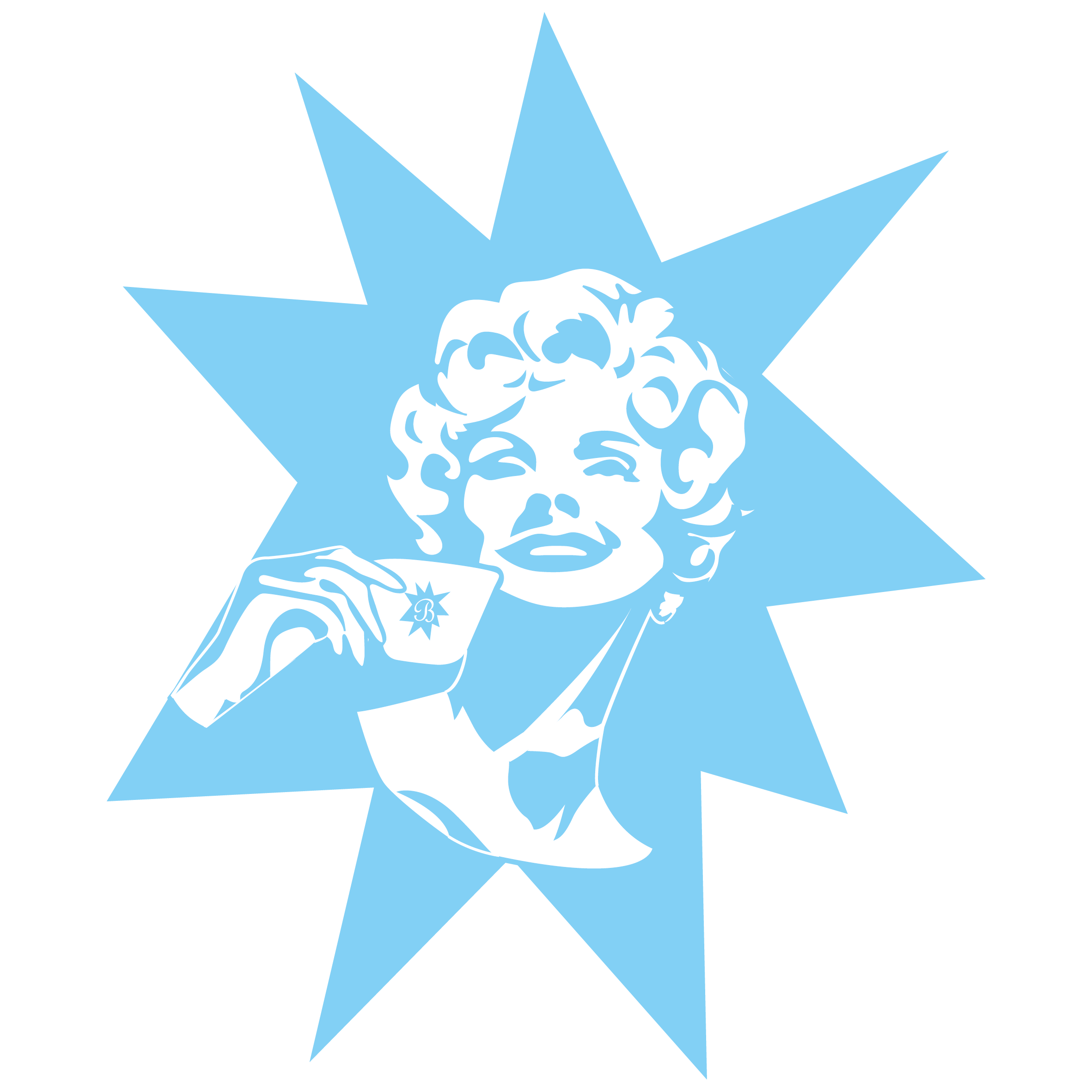
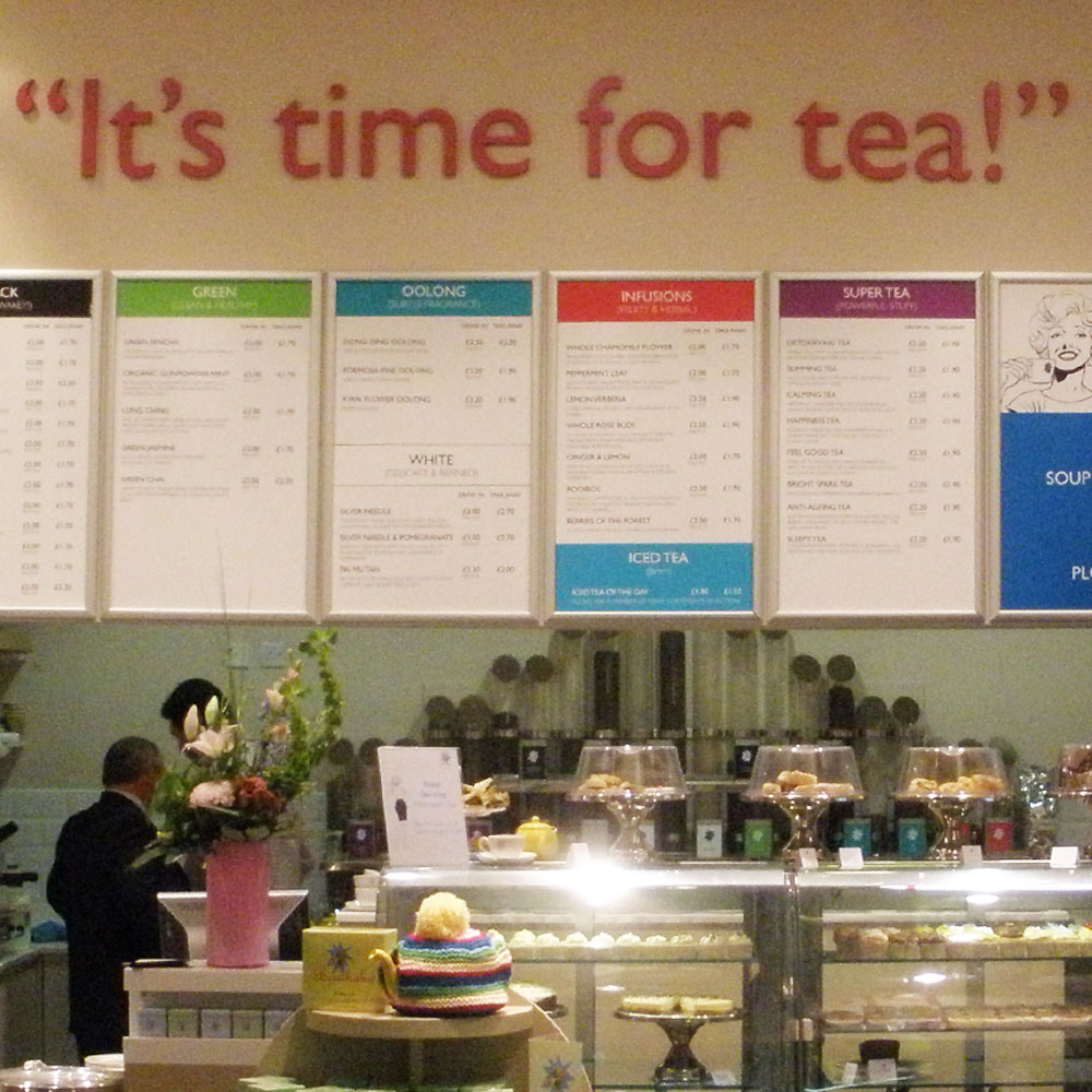
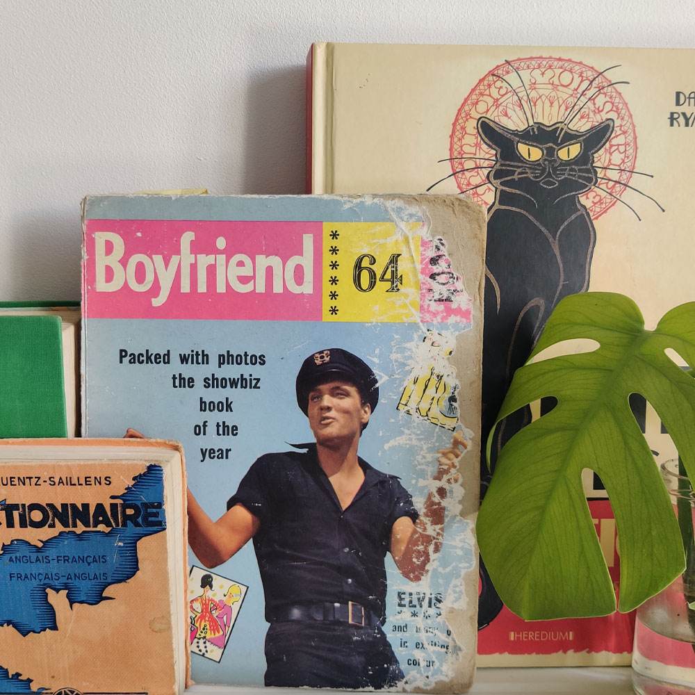
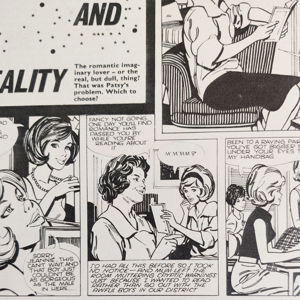
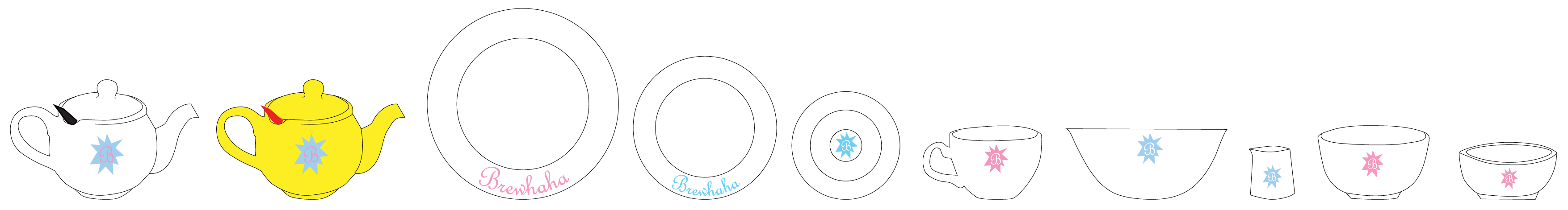
They had designed their own packaging, featuring a vintage image of a woman sipping tea, in an irregular star shape. The branding was grainy, messy and looked homemade, but my instinct was to lean into the peculiar charm of the brand rather than fight it. Staying true to the original logo, I tidied it up and created vector adapts and shorthand versions of their logo allowing them to have more freedom in how they scaled and placed their identity. The colour palette remained vibrant, almost jarringly so, with a retro feel. I worked closely with the interior designer to bring the brand identity to life through the furniture and finishes in the tea room, selecting the right colours for their banquette seating and developing novel ways to add character to the environment, including the addition of bowler hat lampshades and doily printed table tops. I had a desk like a mad-hatter’s tea party as I sourced the right tableware for the tearoom, got quotes on prices and applied their branding on everything from teapots to napkins. I designed uniforms for the nippies (a tea server) and created the menu boards. I shared the founder’s love of vintage imagery, and poured over my collection of 60s girly annuals (one titled ‘Boyfriend 64’ sits in my studio today), pulling on; the style of the illustrations, the humour in the teenage-girl centred stories, and even the grainy colour photography of their pop-idols. An illustrator was commissioned to create a 4 cell comic strip, which span the interior wall of the tearoom, the speech bubbles utilised vinyl text, allowing the dialogue to be changed to reflect the season or any hot topic, but was always a dispute resolved over a cup of tea. Every aspect of the design job was conceptualised, designed, artworked and managed by myself.
Keen to see my work in reality, I headed up to Glasgow to visit the tea room. The atmosphere of the place was fantastic, busy with customers from all walks of life; students, mums, business men, knitting clubs. It looked professional, but also authentic, warm and above-all charming.
Whilst this is not my slickest branding job, I’m incredibly proud of what was achieved and have such affection for this project and the considerations (design, humour, practical, budgetary) that went into it.